The AEIOU Keyboard Model
Keyboards are probably the most common tools we use nowadays. But also, their design terrible. The design looks like someone came up with it completely at random. The design also doesn't take the hundreds of non-english speaking countries into account. There are dozens of keys that noone ever uses. They are mostly leftovers from the "computers exist to do math" era.
"Return", "Page up", "Page down", "Home", "End" - all these keys are designed for easing the experience of typing, but noone touches them. The "F1", "F2", "F3"... keys are in a similar situation. They are used for around three shortcuts. My solution is to add several buttons that are easily "reprogrammable" - to have it easily editable what said button is supposed to do.
The names of the buttons don't sense either. "CTRL" and "ALT" do basically the same function. "SHIFT" is the letter-enlarge key. "TAB" is the key that shifts between selections. The key to lock in/out of enlarging letters is "CAPS LOCK" instead of shift lock. CONTROL is sometimes shortened to CTRL but CAPS LOCK is always written in full. And some of these keyboards change tiny details, like replacing the TAB key with two arrows or changing the Printscreen key to sometimes PRTSCR, sometimes PRTSC, sometimes just a picture of scissors.
Lastly, another great problem is huge difference between the QWERTY (US/UK) and QWERTZ (Europe) keyboard design. The design used in english-speaking countries (QWERTY) includes completely different characters from the european ones. While the english keyboard model focuses on symbols used in offices like $ and useful symbols for accounting or programming - < >, { }... - the european keyboards mainly focuses on diacritics and has most keys that aren't basic letters spread out in a completely different manner. This makes it almost impossible to program on a european keyboard layout.
My Solution
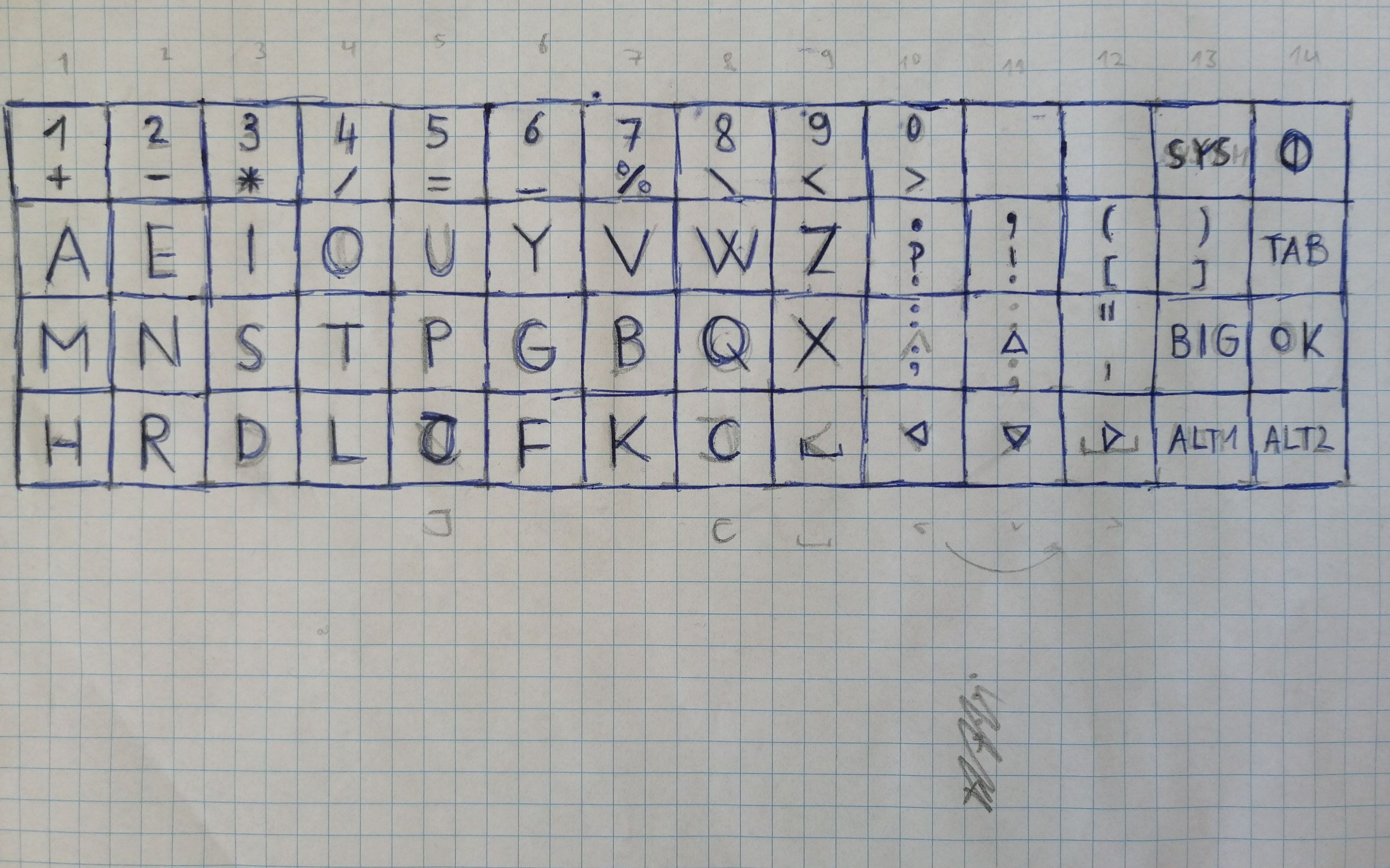
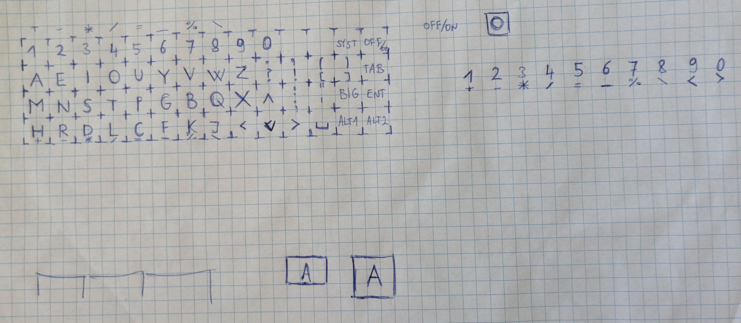
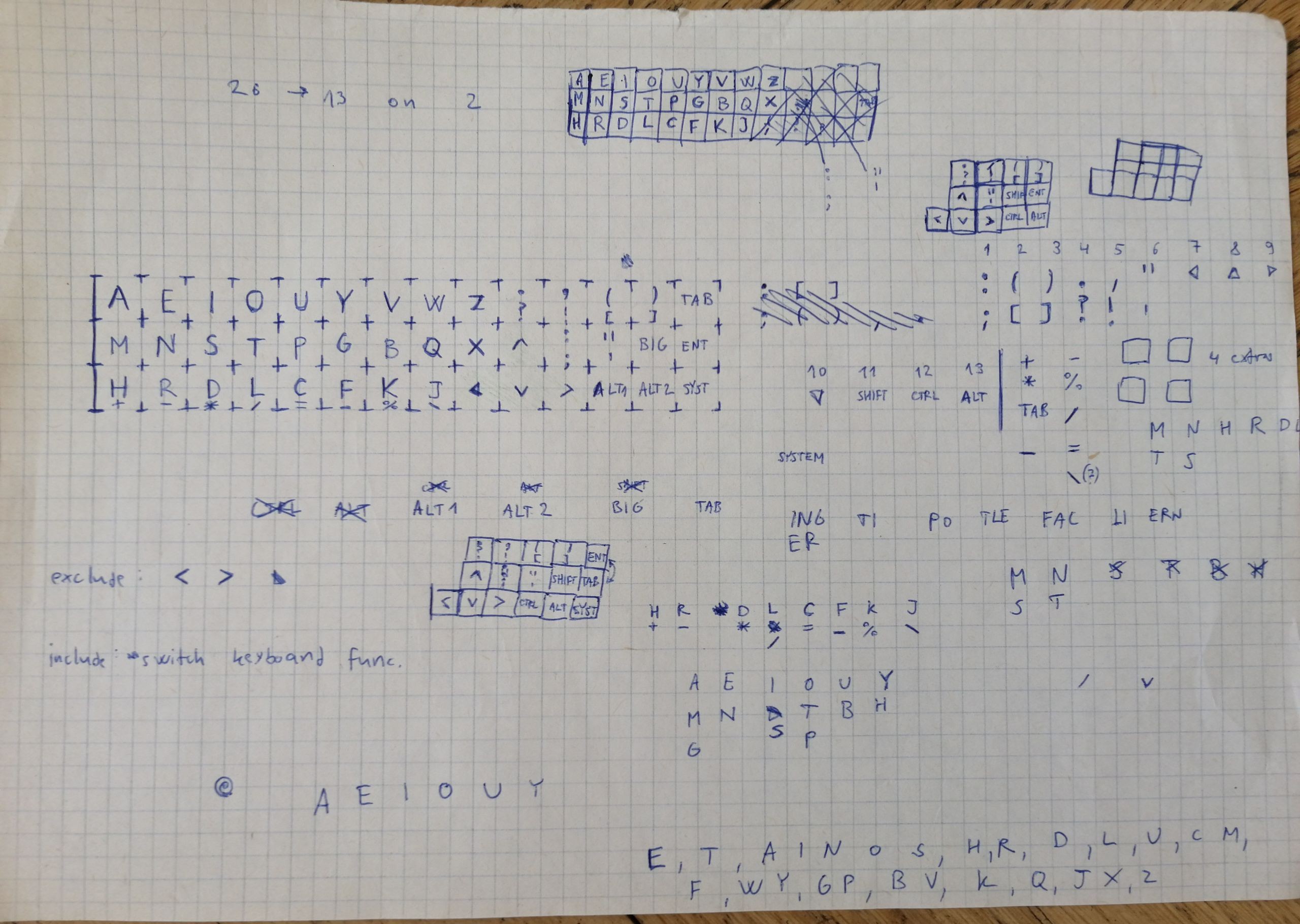
There have been several attempts throughout history to target these issues - most popular was the Dvorak keyboard model, still used by some today. But it only tackles the letter layout of the keyboard, not the fundamentals I already talked about. It's not just letter arrangement that needs to be fixed - most keys should be removed. My solution is: the AEIOU keyboard model.


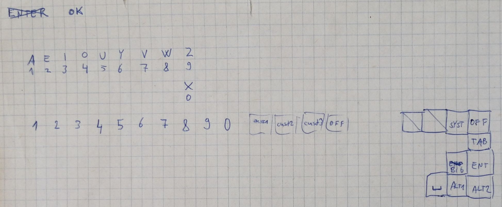
I have removed the many unnecesarry keys and stripped the model down to the bare essentials and basics. The key positioning is much more streamlined. You are less likely to accidentally press the windows key or encounter many daily keyboard "mistakes" we get now. It is only a prototype. I am not a keyboard expert, and some change could probably be done with this model, but it is a vast improvement over the inane nonsense we have on keyboards now.


